I have written over the years that understanding data science (DS), machine learning (ML), artificial intelligence (AI), and related topics is essential for anyone who works in a profession where tools using them might be employed. This is certainly the case in biomedicine, both in clinical practice and research. In the same sense that all physicians should have basic knowledge of pharmacology, radiology, and other topics, even if they are not experts in the science and methods of those diverse disciplines, all in healthcare should be ready for ML and AI tools coming to their work.
Of course, learning to apply ML and AI historically has required a background in math and computer programming that most in healthcare do not have. Fortunately, there has been emergence in recent years of a number of "no-code" DS and ML tools. In some ways they are analogous to statistical packages, which allow anyone who knows how to use them load data and run statistical tests. Of course, that does not mean that the operator of statistical software will apply or interpret the results of their analyses correctly, which is especially important for large or complex data sets where appropriate statistical expertise is essential.
One no-code ML tool that I find particularly easy to understand and use is Orange Data Mining. Orange was developed by the University of Ljubljana in Slovenia and is an open-source project with a large community supporting it. It runs on Mac and Windows machines, for which binary packages can easily be downloaded and installed. Orange is programmed in Python and, as such, can be extended with Python code. It comes with sample data sets and allows easy loading of new ones. The original focus of Orange was for structured data and machine learning models for operating on them, including the main ML tasks of classification (e.g., logistic regression, kNN, and neural networks) and regression (e.g., linear regression, random forest, and neural networks). There are also methods for visualizing data and evaluating models. The latter includes techniques such as splitting training and test data and cross-fold evaluations are easy to configure. There are also various methods for imputation of missing data. In addition, modules have been developed for image analysis and text mining.
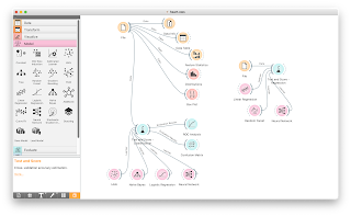
Orange is used by dragging widgets that represent data sets, visualization methods, models, and more on to a canvas called a workflow. Data flows between the widgets by connecting them via simple dragging between widgets. Once one becomes facile in dragging and connecting widgets, workflows can be built up quickly and easily. They can also be saved and reloaded later.
One can start with one of the built-in data sets or use the File widget to load one's own data. Most common rectangular data formats are accepted, such as CSV, tab-delimited, and Excel files. Included among the sample data sets is one for heart disease. The data itself is old (Detrano, R., Janosi, A., Steinbrunn, W., Pfisterer, M., Schmid, J., Sandhu, S., Guppy, K., Lee, S., & Froelicher, V. International application of a new probability algorithm for the diagnosis of coronary artery disease. American Journal of Cardiology, 1989, 64, 304-310.) and small (303 records with 13 variables), but the data set offers a good way to get started with Orange using clinical data. The outcome variable (called the target variable in Orange) is coronary artery diameter narrowing and the predictor variables include gender, chest pain, serum cholesterol, systolic blood pressure, and more.
The screenshot below shows a workflow I built using the heart disease data set. As in most data science analyses, one can begin with methods to explore and visualize the data. I connected a number of widgets that allow the data to be viewed in a data table and visualized in the form of feature statistics (also shown below), distributions, and box plots. I also created some models using the Test and Score widget connected to a number of different models appropriate for classification, in this case logistic regression, naive Bayes, and a neural network. One can view the classification accuracy, F1 score, and other evaluation variables (also shown below) and connect the results to widgets that compare ROC curves and generate confusion matrices for each model. (Perhaps not surprisingly, logistic regression works best!) Likewise, I created some models for regression with ST-segment elevation as the outcome variable, using linear regression, random forest, and a neural network, which can also be seen on the workflow.
It is fairly easy to get started using Orange. A set of video tutorials on the Orange YouTube channel covers the basics as well as a number of advanced topics. My colleague Dr. Robert Hoyt and his collaborator, Dr. David Pashtikoff, have been developing workshops and other learning materials using Orange, available at a Web site they have developed called, NoCode Data Science. They plan to publish a textbook, and setting up a login on the site allows access to a number of additional data sets that can be loaded into Orange.Just as with statistical packages, just because one can load data into Orange and apply ML models does not mean that one is doing so correctly. On the other hand, my simple workflow just scratches the surface of what can be done with Orange, even for this tiny data set.
There are limitations of Orange as a data mining tool. I do not know how scalable it is as data sets get large (all data is kept in computer RAM), and of course any serious ML analysis requires more than the ability to just plug data into models. Nonetheless, Orange can be a great tool for learning machine learning without getting bogged down in coding, debugging, and the like. I see a great future for it in teaching ML as the reach of AI advances.


